Packaging & Branding
Nokia Angular Expression 2014
In the wake of the simplification of product specific categories, Nokia’s packaging had defaulted back to one of its strongest brand assets at the time, Indigo Blue. This created a strong and identifiable visual presence at retail, but with a colourful product design strategy, it was often a challenge to create comfortable colour harmonies between product and brand.
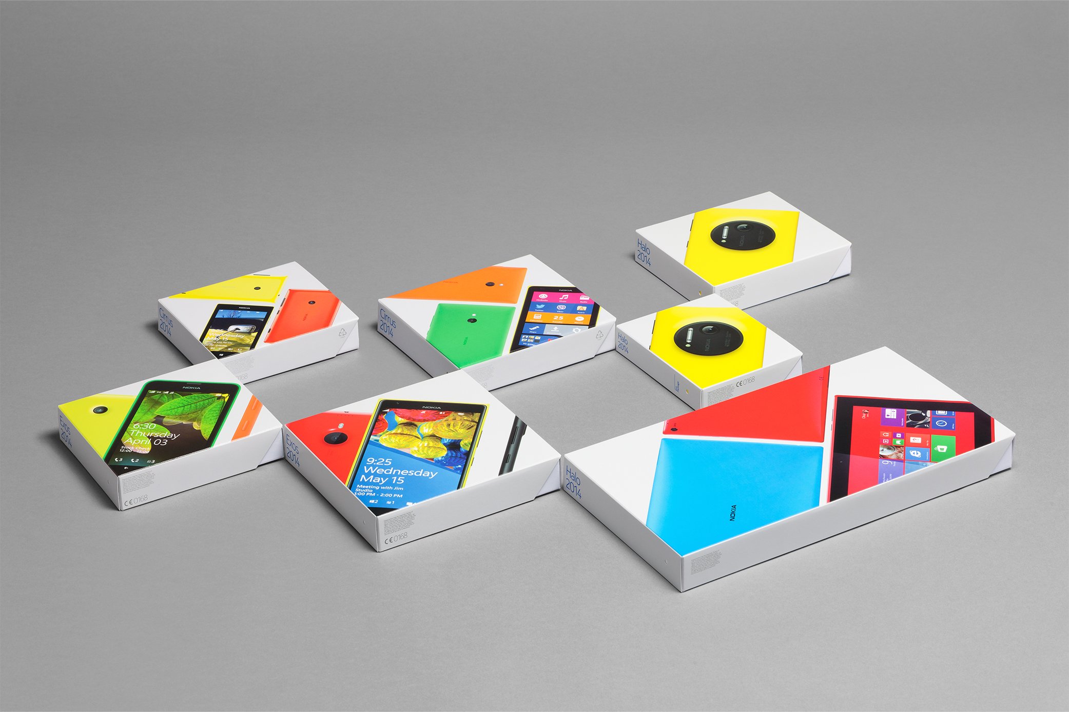
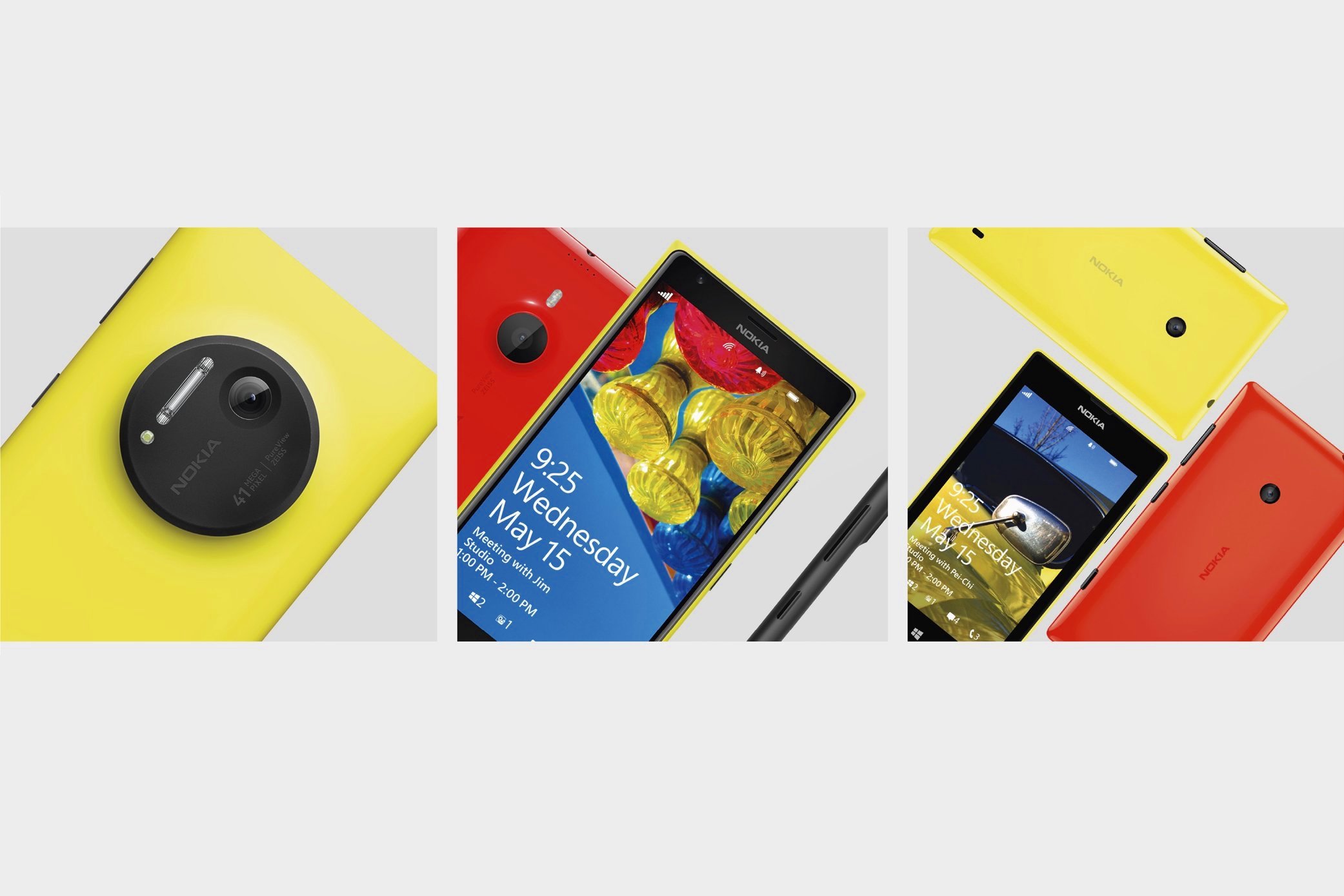
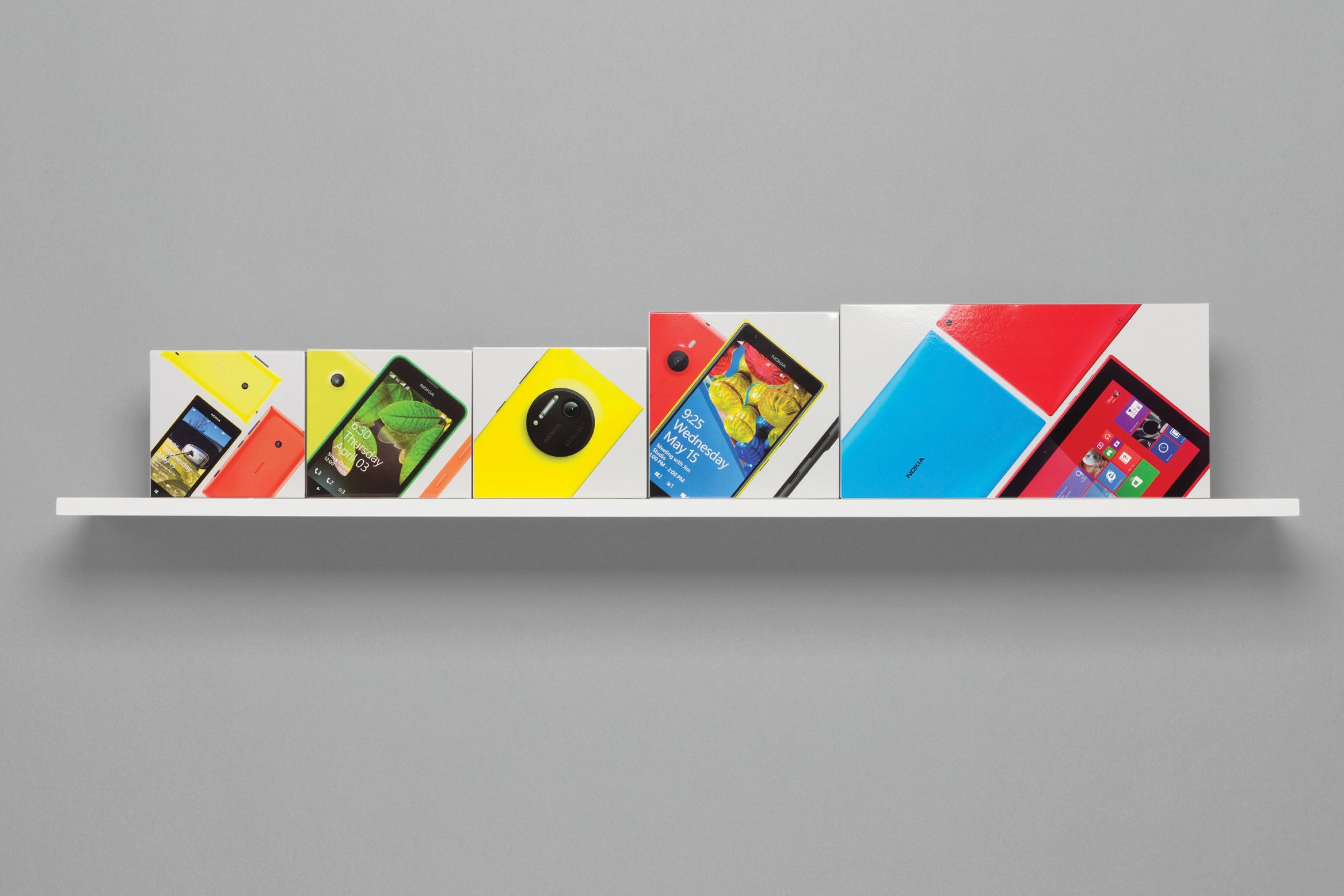
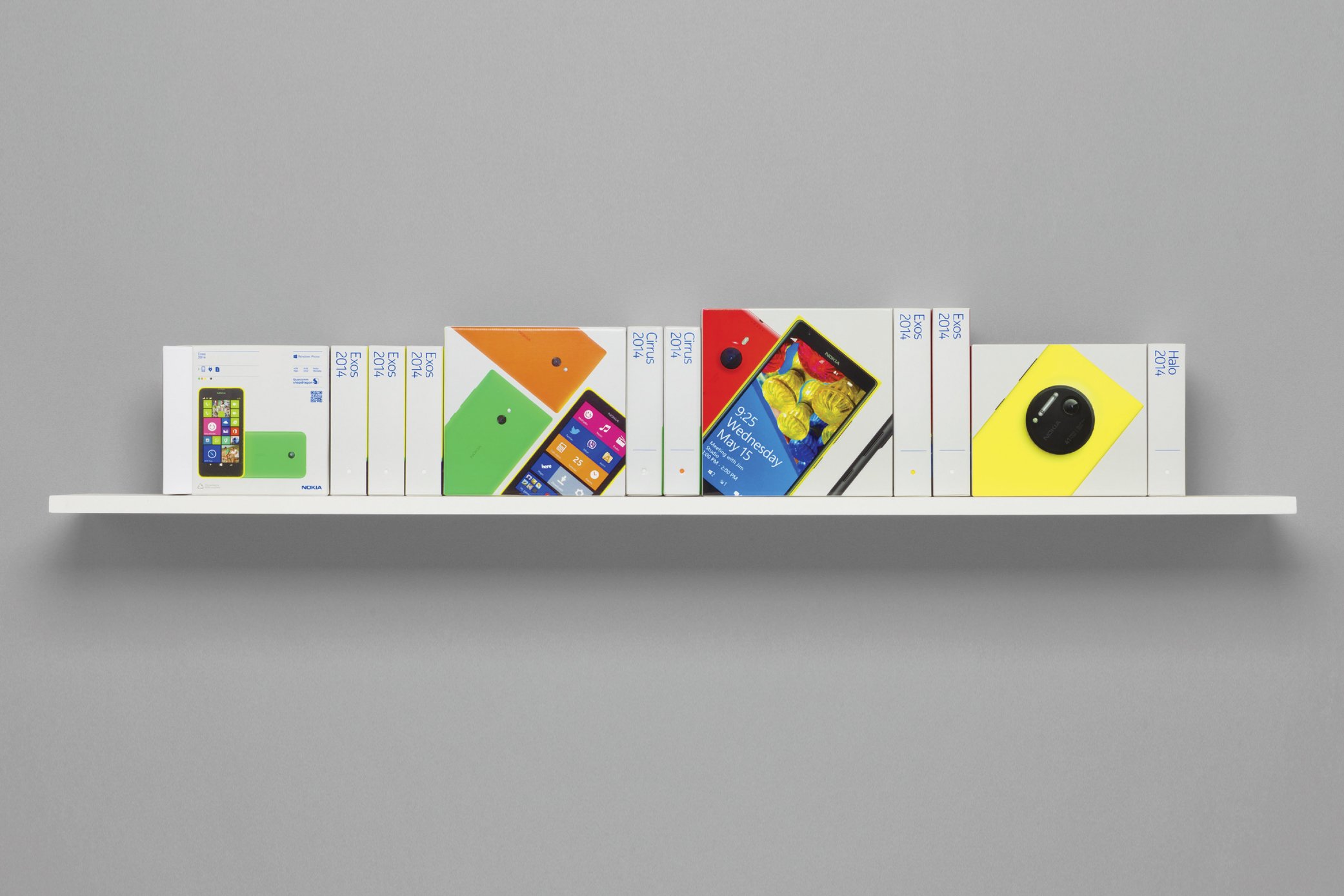
After 3 years in market, we were asked to refresh the look and feel of the Nokia Packaging portfolio, considering all the learnings from the more harmonised approach the Indigo Blue had to offer. We decided to celebrate and elevate our products and put them as the hero, but keep a strong and consistent visual identity using an angular expression.
Inspired by the language of geometry and the forms found within our products, we explored the proportions, intersections, combinations, and harmonies. We deconstructed and reduced them down to the purest elements and angles to derive a flexible, yet systematic order.
With geometry and symmetry at its core, this ordered scheme could stretch from the simplest product display to the most complicated and conceptual compositions. Whatever the size or intricacy of the communication, this structure ensures a familiar structure and visual language, whilst avoiding the dullness of repetition.
Role:
Design, Creative Direction
Contributers:
Stephen Wells
Chris Merrick
Nokia / Microsoft Design Team

Before

After

Angular expression

3 expressive art directions

Disruptive tesselation

Retail ready

Competitive landscape