Packaging & Branding
Microsoft Angular Expression 2015
The 2014 Angular Expression created a strong visual identity across the portfolio, released the grip Indigo Blue had on the brand, and was a signifier of the Microsoft acquisition. The newly formed teams agreed that a unified approach going forward was the correct strategy.
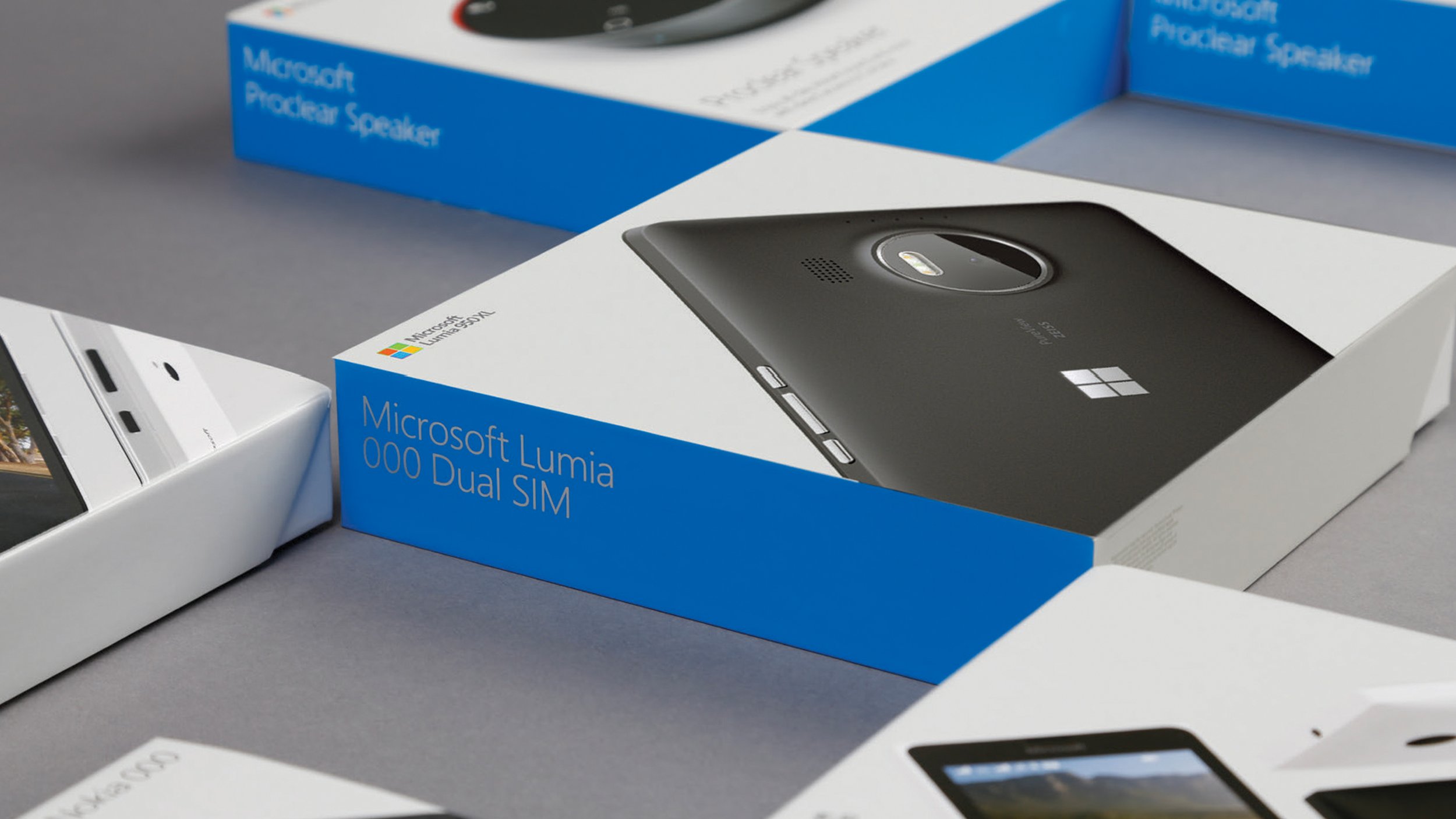
The driver for cohesion was the work we had already done with the devices packaging; the visual approach, using strong grid systems for placement of logo and type, and having such a strong systematic approach to the process.
However, we were challenged with moving the work on even further, and with refreshing the system to create something still dynamic and expressive that also gave the products better representation.
Our starting point was within the digital and motion space, giving us the opportunity to inject more dynamism and interplay to our products. With a seismic shift away from the static views favoured by our competitors, key frames from the film become our hero product/assets, allowing us to directly address the requests from business and brand, enlivening our products, whilst demonstrating materiality, product features, form, and the design overall.
We’ve retained all of the system thinking from the previous identity; however, the approach now allows for even greater visual flexibility and adaption to other communication areas across our brand. This delivers an engaging, coherent, and expressive identity across all channels.
Role:
Design, Creative Direction
Contributers:
Stephen Wells
Chris Merrick
Nokia / Microsoft Design Team
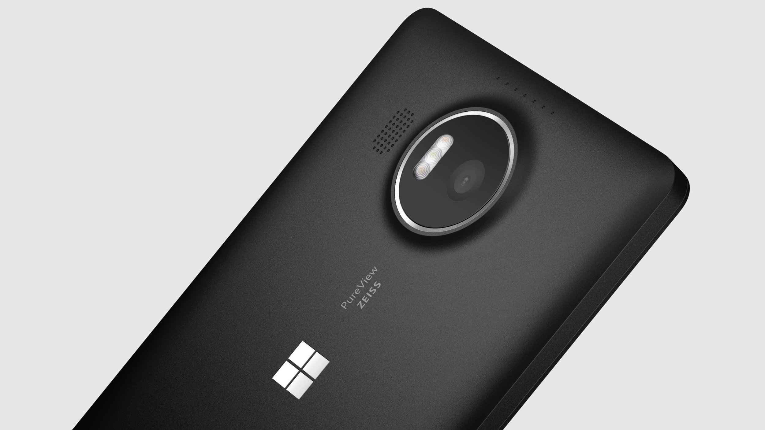
Angular expression 2015
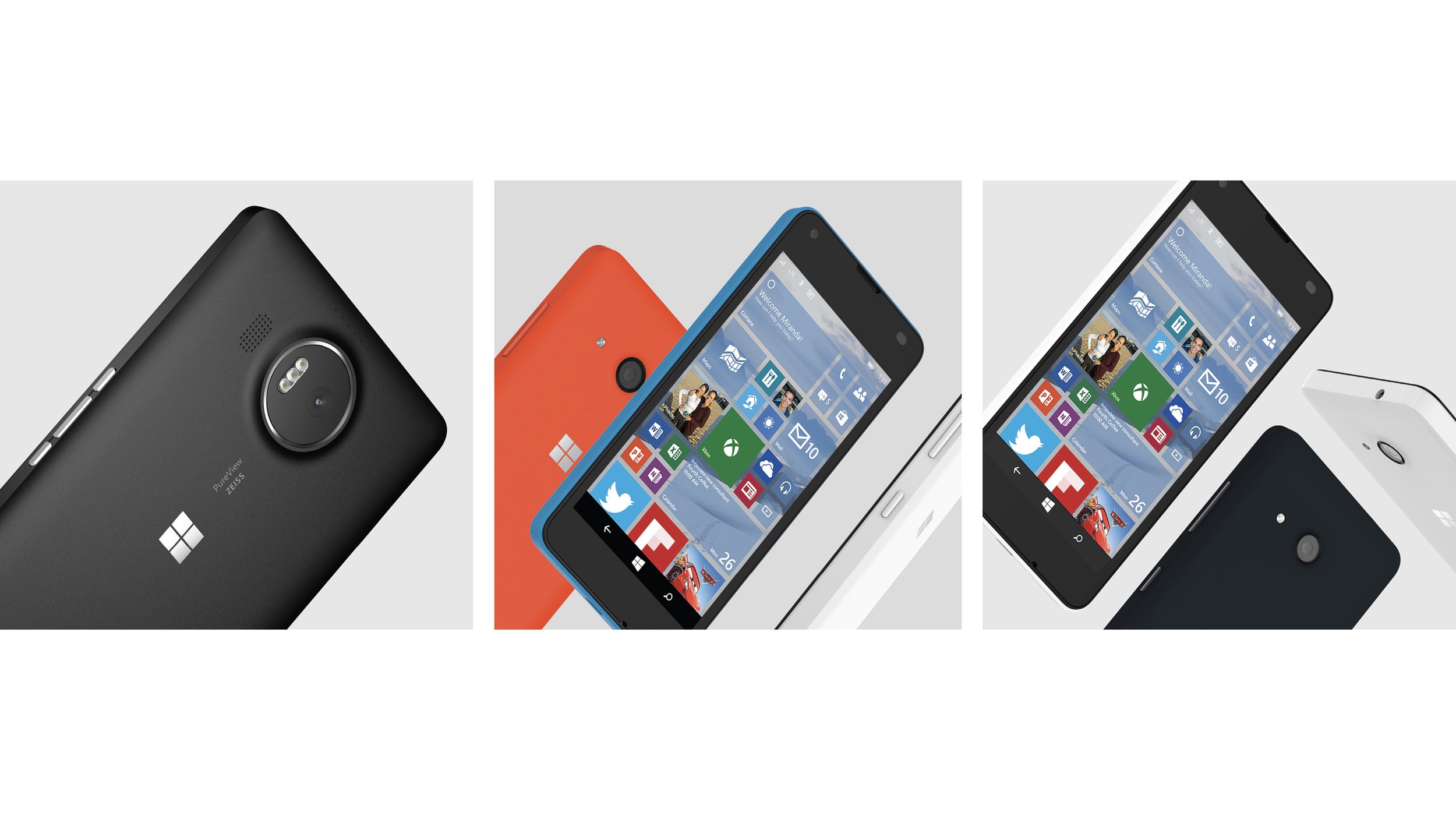
3 Expressive Art Directions
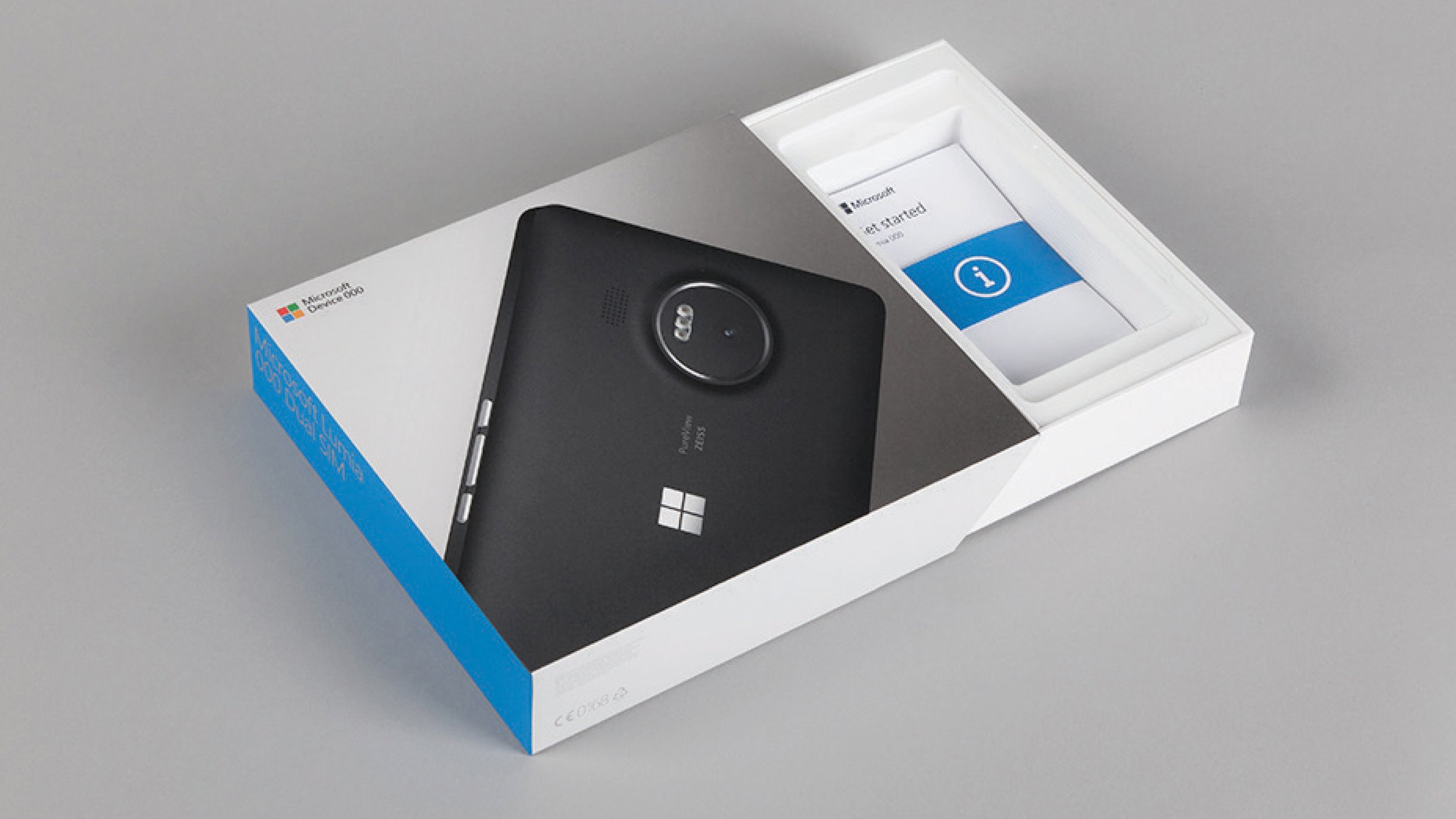
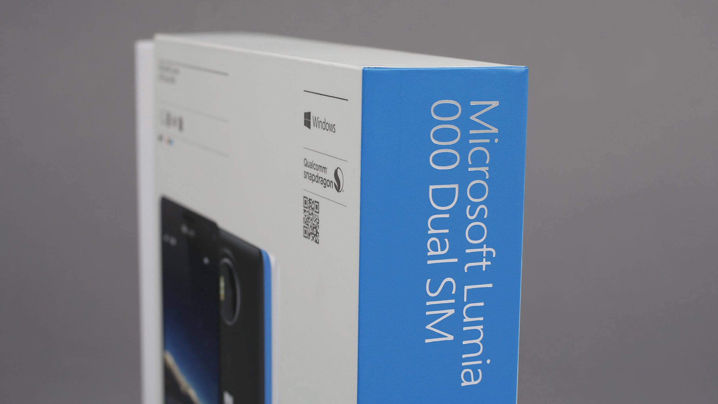
Premium packaging and unboxing
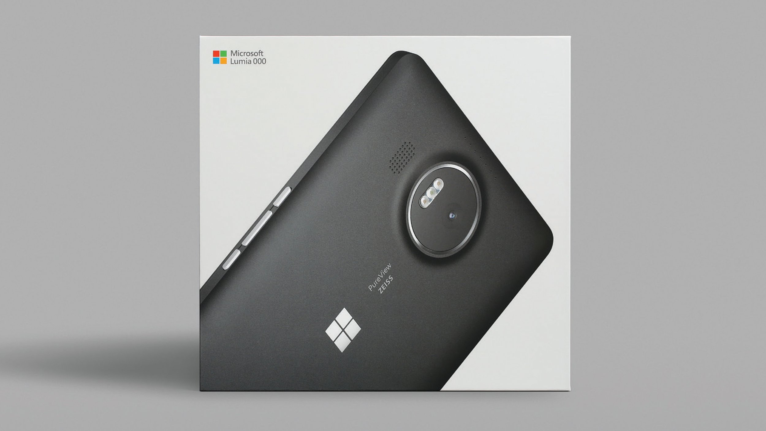
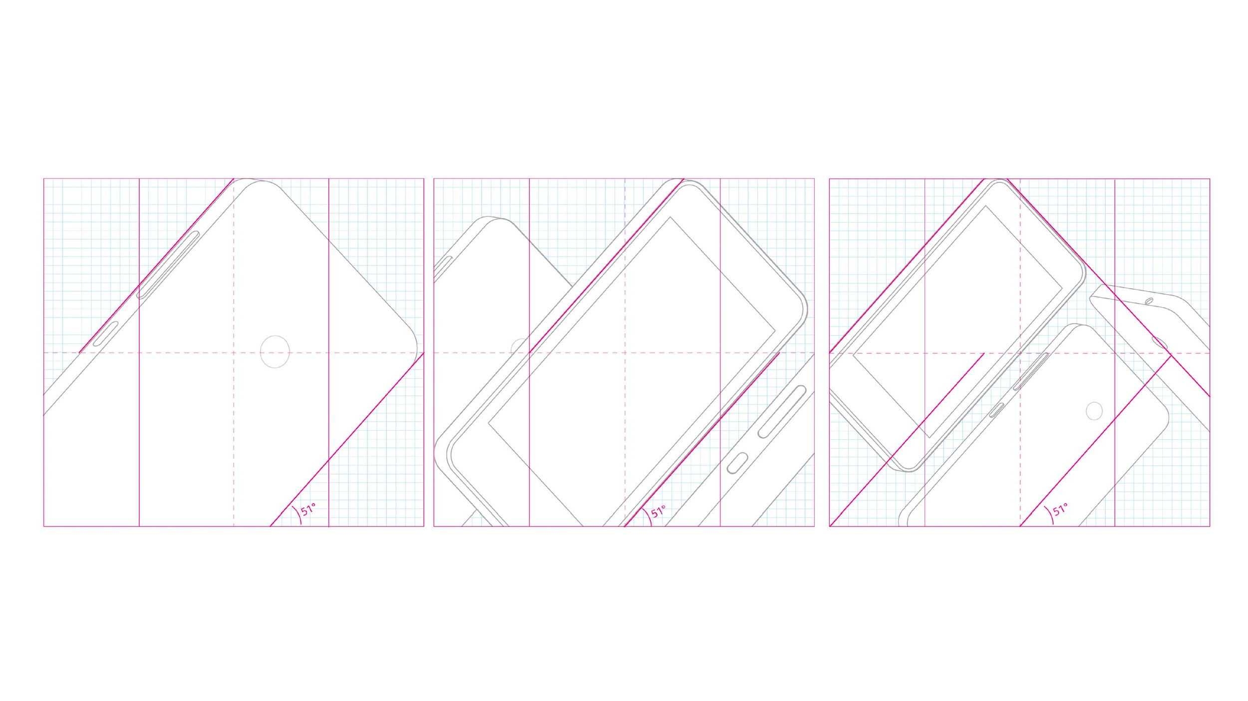
Layout grid
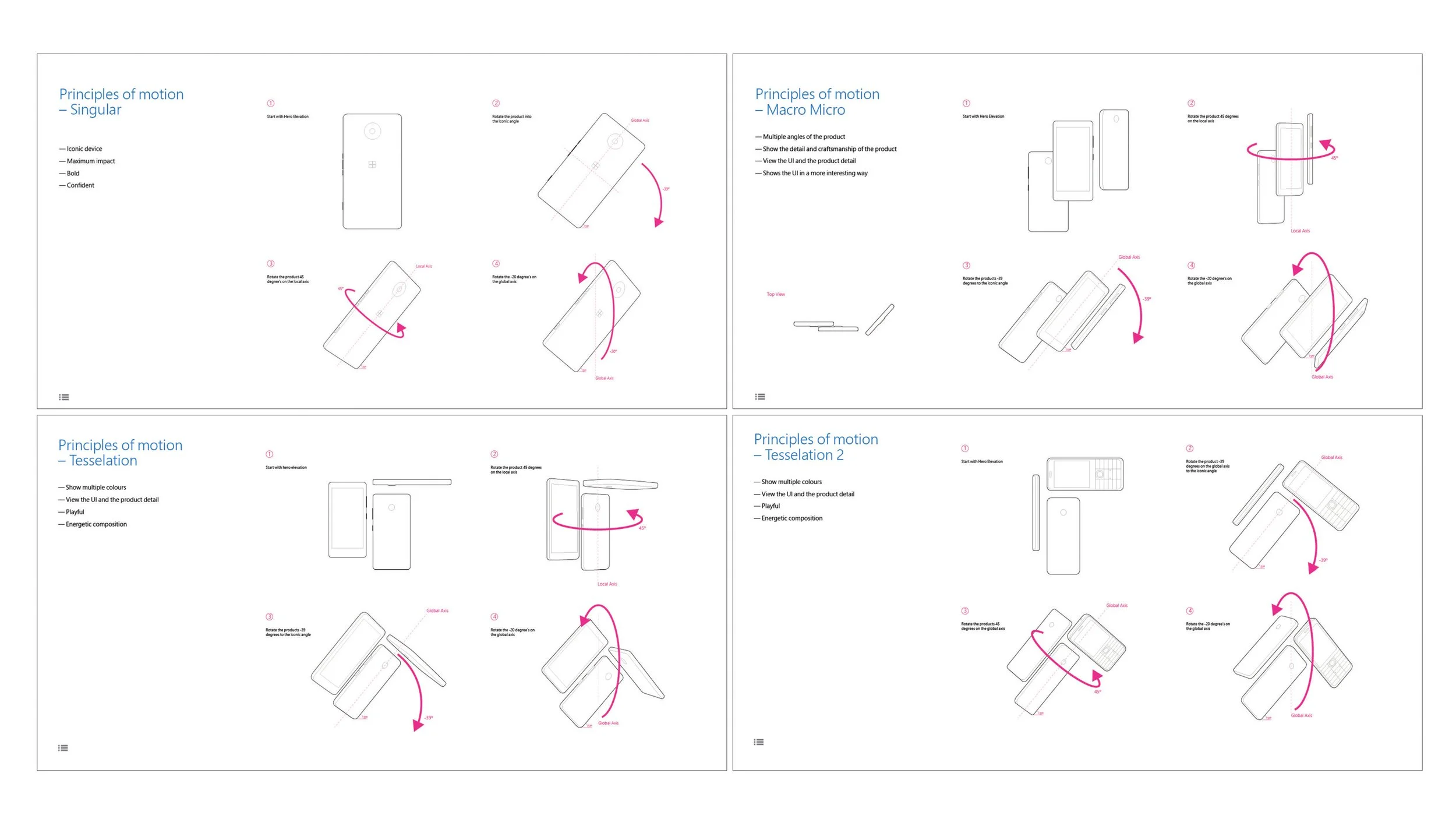
Principles of motion

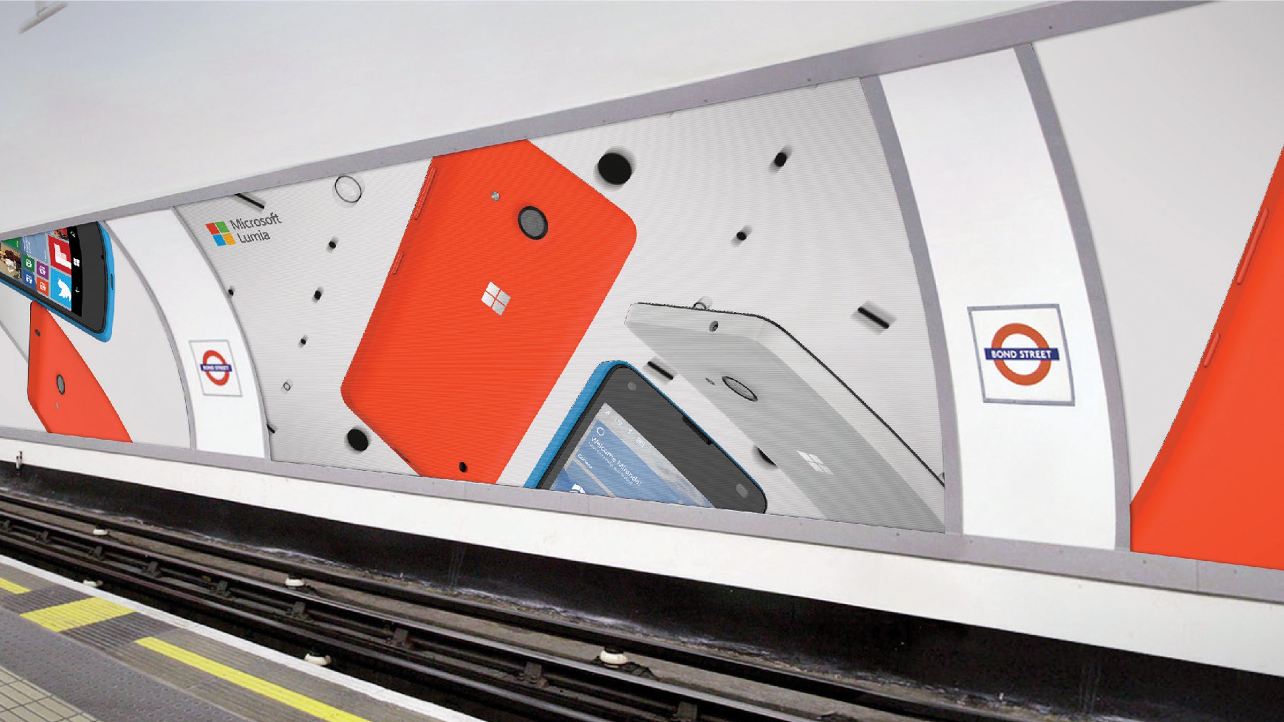
Campaign activation

Campaign activation
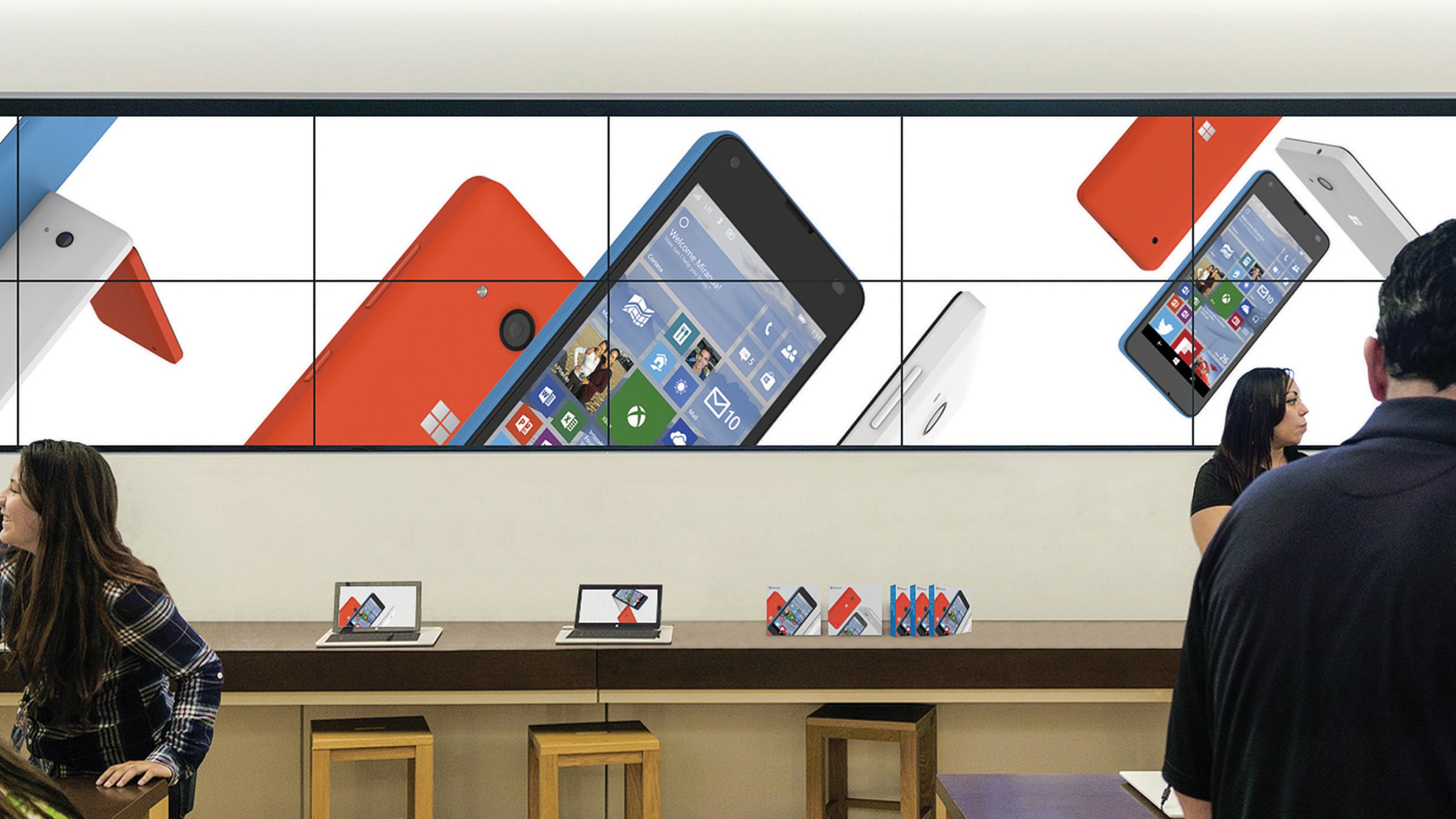
Microsoft Store

Event Kiosk