Visual Expression
Project Symbol
Paula Scher says “You can make something feel like the same thing and vary it significantly”
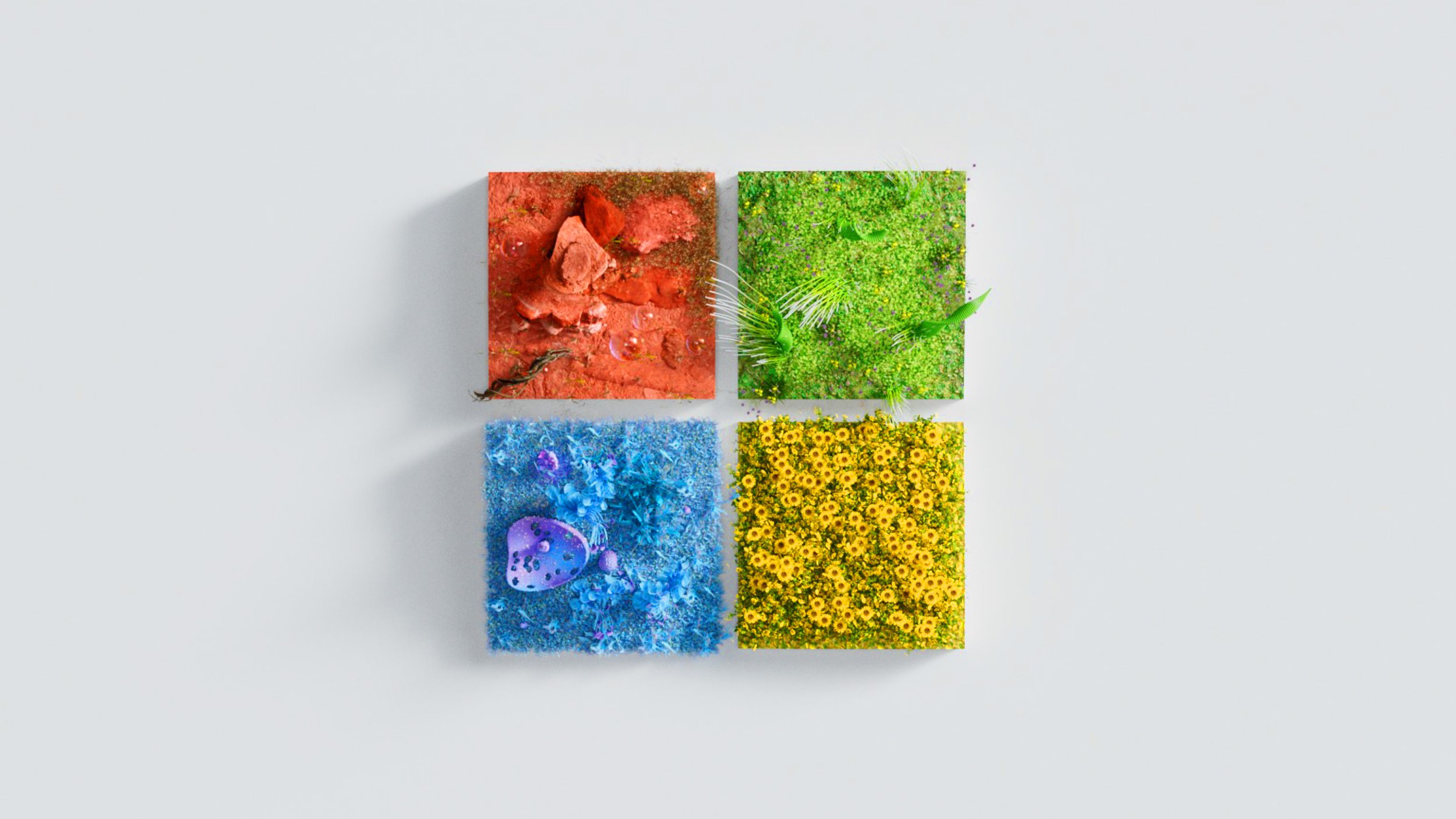
The Microsoft Symbol is the most visible and frequent reminder of what the brand stands for.
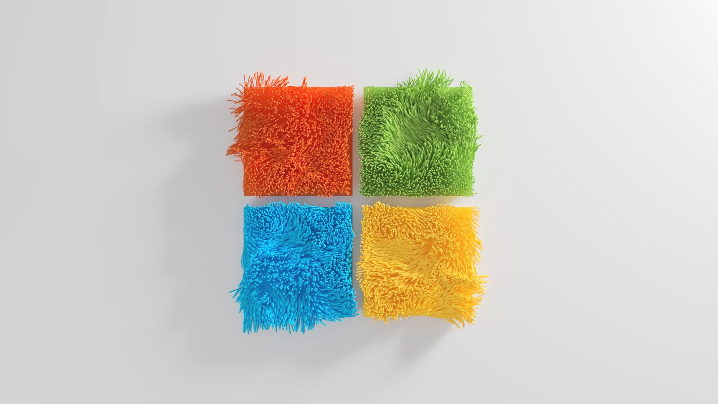
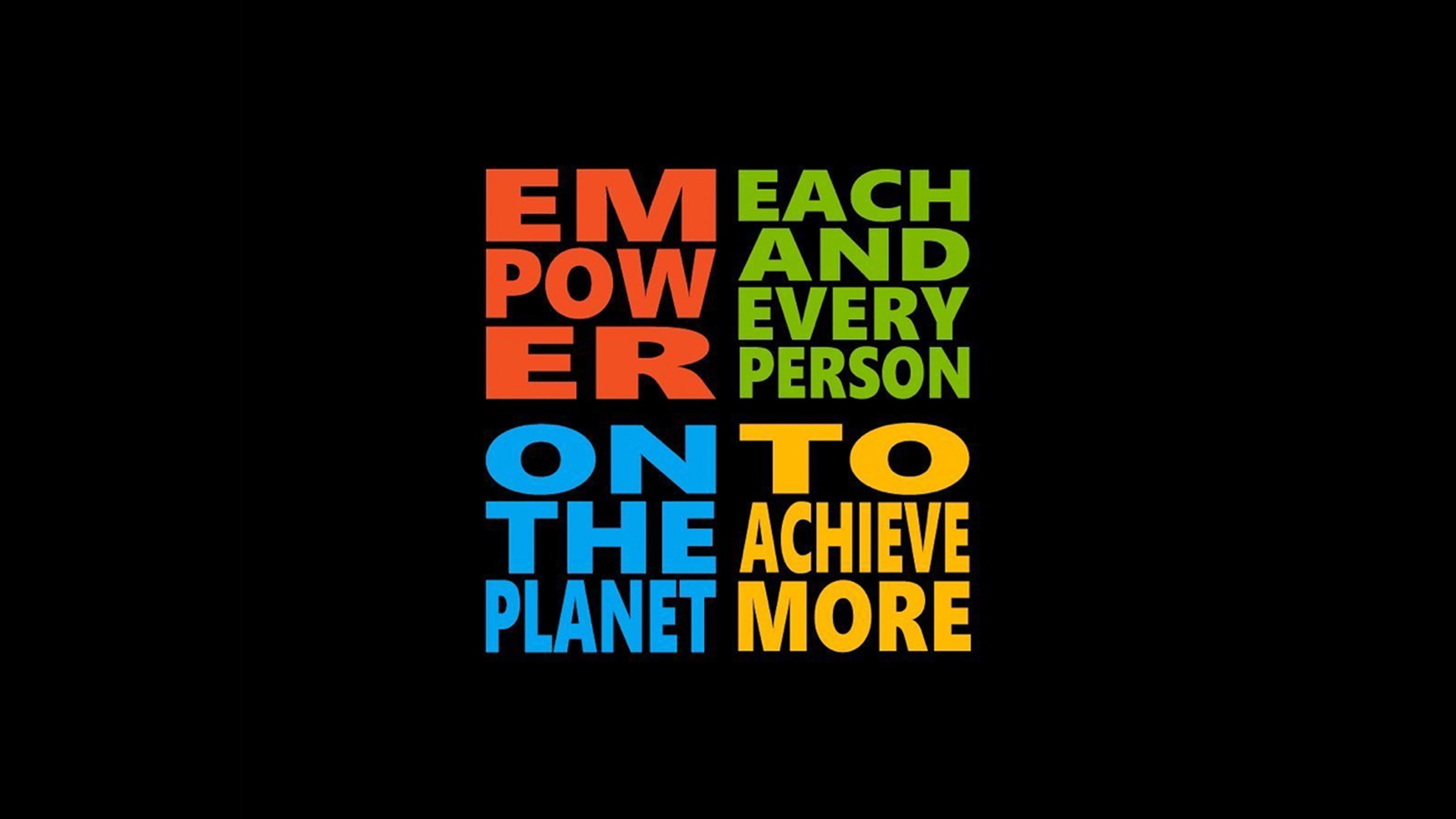
But there are always opportunities to provide clarity and reinforce meaning through exploring the design and form of the symbol in the context of different themes.
We often have fun exploring more strategic yet playful expressions for the brand, both internally and with our creative partners.
Role:
Design, Creative Direction
Creative Partners:
MvM
Gabriel Morala
Cinco

